18 minute read · September 11, 2019
Querying Cloud Data Lakes Using Dremio and Python Seaborn
· Dremio Team

Introduction
In the last few years, more and more companies have realized the value of data. Therefore, the popularity of data analytics has been growing rapidly. In general, data analysis can be performed in several ways, which are classified into subtypes depending on the analysis task: descriptive, exploratory, inferential, predictive, causal, and mechanistic. Each of these methods involves data visualization.
Data visualization helps to detect hidden data dependencies and better understand data structure for further processing. In this tutorial, we will visualize data from Amazon S3 using popular and functional Seaborn Python package. Dremio will help us to connect these tools as well as prepare the data for visualization and analysis.
Assumptions
We assume that you have the following items already installed and setup:
- Dremio and Dremio ODBC Driver
- Amazon account
- Jupyter Notebook environment
- PyODBC
- Python packages: Pandas, Numpy, Matplotlib, Seaborn
Data overview
For this article, we will work with Audit Data Dataset. This dataset is the research result that can be used for predicting the fraudulent firms based on the present and historical risk factors. These risk factors were examined from various areas such as past records of audit office, audit-paras, environmental conditions reports, on-going issues report, etc. Note that risk factors are evaluated and their probability of existence is calculated from the present and past records.
We have stored the data in Amazon S3 as CSV files.


To access this data in Dremio, you need to get Access key ID and Secret access key. Go to the Security, Identity, & Compliance section in the list of services in AWS Console and click on IAM. Then select the user and click on the Create access key button in Security credentials menu.

Connecting Dremio to Amazon S3
In the Sources section, click on the corresponding button to add a new source and select Amazon S3 database. Then, enter Name and Authentication information. Click the Save button.

After that, the new data source will be created containing our data stored in Amazon S3.

Data curation in Dremio
First of all, it is necessary to access the files in the form of data tables with the required parameters. Click on the file and specify the next parameters as shown on the image below:

After that, it’s necessary to set the correct data format for each column. Set the numerical variables to float or integer. The option Replace values with null is required because we have null data in our dataset. We won’t replace these values now, but we will deal with them at the data preprocessing stage.

After applying the changes, save the dataset to your space. Perform these steps with both files and, as a result, we will get two virtual datasets.

We will join the resulting data in order to get one dataset for future visualizations. To do this, go to one of the datasets and click the Join button. In Custom Join, select the other dataset and click Next. Select joint columns and click Apply.


Next, we’ll drop the duplicate columns.

Connecting the Python environment to Dremio
We will use Seaborn, a Python package for data visualizations. Therefore, we need to connect Dremio with Python.
To build an algorithm for connecting Dremio with Python environment, we need the following information:
- user_id – Dremio user
- user_password– password for user_id
- sql query – SQL query with the path to Dremio space.
Path to Dremio space can be received as shown on the screenshot below.

Now you can launch your Jupyter Notebook environment and connect it to the Dremio.
The algorithm of connection can be defined as follows:
import pandas as pd
import pyodbc
# Dremio's users credential
user_id = 'user'
user_password = 'pass'
# setup the ODBC connection to the Dremio instance
user_info = r"DSN=Dremio Connector;UID={user};PWD={pwd}"
cnxn = pyodbc.connect(user_info.format(user=user_id, pwd=user_password),
                      autocommit=True)
# SQL style query to retrieve the required data from Dremio
sql = r'SELECT * FROM "audit-data"."data"'
# executing the query using the already open ODBC connection
df = pd.read_sql(sql, cnxn)
As a result, the data will be presented in the Pandas DataFrame table.

Data preprocessing
This process is required to transform the data into a format that is acceptable for further analysis. The first thing we will do is analyze the dataset to Null elements:
df.isnull().sum()
The result is shown below

We will fill Null elements with the mean value.
df['Money_Value'].fillna(df['Money_Value'].mean(), inplace=True)
print('Null Elements: ', df.isnull().sum().sum())
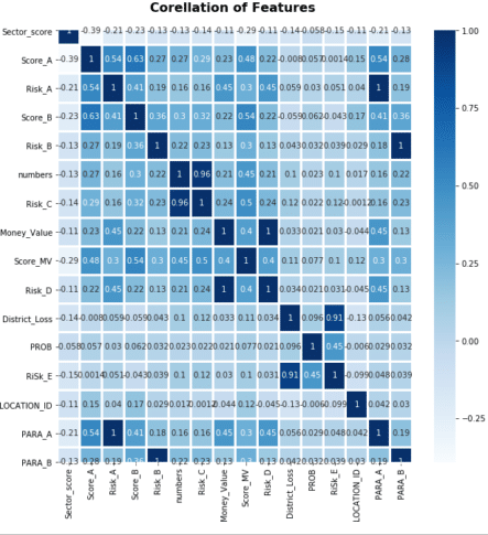
We also want to analyze the correlation between the parameters by building a correlation matrix.
import seaborn as sns
sns.heatmap(df.corr(), annot=True, linewidth=2, cmap=plt.cm.Blues)
plt.title('Corellation of Features', weight='bold', fontsize=16)
plt.xticks(rotation=90)
plt.show()
Correlation matrix shows the dependencies between the parameters, which will be useful for our further analysis.

Seaborn graphs
Seaborn is a Python library for creating informative statistical graphics. Its algorithms are closely integrated with Matplotlib, PyData, Numpy, Pandas and such statistical libraries as SciPy and Statsmodels.
Let’s start with building a count plot of Score with the Risk parameter.
import seaborn as sns
import matplotlib.pyplot as plt
sns.countplot(x='Score', hue='Risk', data=df)
plt.title('Score by Risk\n', weight='bold', fontsize=16)
plt.grid(ls="--", zorder=1)
This diagram shows a difference in Score rate by Risk.
Next, using relplot we will show the following dependencies:
- between Inherent_Risk, Audit_Risk, and Score
- between Score_A, PARA_A, and Risk.
sns.relplot(x="Inherent_Risk",
y="Audit_Risk",
hue="Score",
data=df)
sns.relplot(x="Score_A",
y="PARA_A",
hue="Risk",
kind="line",
data=df)

Each of the graphs shows the dependence of three different parameters. The change in the dependence of the Score and Risk parameters is shown in color. Analyzing them, we can see that all dependencies are linear.
Let’s visualize two numerical parameters dividing the points by the third categorical parameter using catplot.
sns.catplot(x="Marks",
y="Audit_Risk",
hue="Score",
kind="swarm",
data=dff)
plt.title('Marks and Audit Risk by Score', weight='bold', fontsize=16)
plt.grid(ls = "--", zorder = 1)
This graph demonstrates the dependency of the Audit_Risk and Score parameters from three fixed Marks values. The maximal variation of these parameters is for the case when Marks equals 2.
The Seaborn functionality allows building data visualizations for probabilistic analysis and further statistical processing. We’ll use jointplot to build such graphs for the Money_Value and TOTAL as well as PARA_A and Risk parameters with regression and kde views.
sns.jointplot(x='Money_Value',
 y='TOTAL',
 data=df,
 kind='reg')
sns.jointplot(x='PARA_A',
y='Risk',
data=df,
kind='kde')

These graphs show and characterize the concentration and variation of the specified parameters from the average value.
You can also use catplot with Boxplot and Violin views.
Next, we will show the comparison of the Score and TOTAL parameters using Boxplot.
sns.catplot(x='Score',
y='TOTAL',
data=df,
kind='box',
height=2,
aspect=2)
plt.title('TOTAL and Score by Boxplot', weight='bold', fontsize=16)
plt.grid(ls="--", zorder=1);
It is also possible to present this graph in a different way by changing the value of the kind parameter to boxen.

These diagrams show the statistical variation of the Total parameter compared to the Score values. The largest variation is observed when the value of the parameter Total is greater than 4.
Let’s look at the comparison of the numbers and Score parameters using Violin view.
sns.catplot(x='numbers',
y='Score',
data=df,
height=4,
aspect=2,
kind='violin')
plt.title('Number and Score by Violin', weight='bold', fontsize=16)
plt.grid(ls="--", zorder=1)
The Violin diagram also characterizes the statistical parameters variation. As we can see, there is practically no variation when the number parameter is equal to nine.
The Seaborn also allows you to compare multiple parameters with each other using grid graphs. We’ll use PairGrid to compare different types of risks (“Risk_A”, “Risk_B”, “Risk_C” parameters) with the History parameter.
pair_grid = sns.PairGrid(df, vars=['Risk_A','Risk_B','Risk_C'],
                 hue='History', palette='RdBu_r')
pair_grid.map(plt.scatter, alpha=0.8).add_legend()
The same parameter comparison can be performed with pairplot. Let’s do it for the Score, Money_Value, and Marks parameters.
sns.pairplot(df[['Score',
'Money_Value',
'Marks_b']], hue='Marks_b')

Series of pairgrid and pairplot graphs allow to describe and understand the dependence between various parameters. And as a result, we can include or exclude some parameters from our research.
Let’s also demonstrate the comparison of multiple parameters using FacetGrid.
options = dict(s=30, linewidth=.9, edgecolor="b")
face_grid  = sns.FacetGrid(df,
col="Risk",
hue="History",
palette="Set1")
face_grid  = (facet_grid.map(plt.scatter, "Money_Value", "Score", ** options)

             .add_legend())
These graphs describe the dependency of four parameters. As we can see, the variance of Money_Value and History is bigger when Risk equals 1.
Conclusion
In this article, we have described how to create data visualizations using Amazon S3, Dremio, and Seaborn. Amazon S3 was a place where we store the data, which then was imported to Dremio and curated. After that, we connected Python to Dremio and performed statistical data visualization using Seaborn library.


