Intro
Amazon Simple Storage Service (S3) is a data lake service for storing files of any type and volume. It is valued for high availability and reliability, easy scaling, and fault-tolerance. S3 provides an unlimited space for storing files ranging in size from 1 byte to 5 terabytes. The files are stored in separate buckets, in which you can create directories and subdirectories. You can apply different kinds of security policies to the buckets: make them private, public, and also share the rights between users.
However, in order to use Amazon S3 with Qlik Sense, a popular BI tool, you would need to copy the data into a relational database, which adds time and inconvenience. With Dremio, however, you can run Qlik on S3 directly, simplifying and accelerating your analytics. Let’s see how it works in practice.
Assumptions
To follow this tutorial you should have Dremio and the ODBC driver already installed. If you don’t have them installed, go to the Dremio’s deployments page and pick the installations for your operating system. Also, we will work with Amazon S3 and Qlik Sense Desktop, so you need to have them installed and configured as well. We also recommend you read Getting Oriented to Dremio and Working With Your First Dataset and get acquainted with other Qlik Sense and Dremio tutorials.
Loading data into Amazon S3
Today we will work with Kaggle’s US Census Demographic Dataset which includes information about demographic and economic characteristics for every US state. In particular, we will explore average income and employment/unemployment rates.
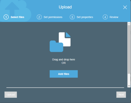
The first step is to create a bucket in your Amazon account and upload a data file from your computer.

To access buckets, Dremio uses AWS access keys that you must generate from your account. To do this, sign in to the management console of your account and click on the account name at the top of the page and select My Security Credentials in the pop-out menu.

Select Access keys and click on Create New Access Key button. Then you will be able to save the file with the new AWS Access Key and AWS Secret Access Key. Later, you will need them to access the buckets in Dremio. Also, to read more about working with files stored in S3, visit Dremio’s documentation.
Data curation in Dremio
Start by creating a new space, called Amazon. Then, connect to a new data source, and select Amazon S3 as a type. Specify the name, provide the credentials of your AWS account, explore other available options and properties, and click Save.

Now, if you navigate to this source, you can see all the buckets associated with your AWS account. In our case, we have dremiobucket with the data folder that contains our previously uploaded CSV file. Open it in the Dataset Settings menu.

Let’s transform this data. First off, we need to convert the variables to appropriate data types> n particular, numerical values should be changed to integer and float.
Next, as we want to visualize the average income and unemployment rate by state, we need to look at 2 variables:
- Unemployment - the unemployment rate,
- IncomePerCap - the average income for the employee for the year.
However, these measures don’t take into account the number of people who have the indicators. Therefore, we will create new variables that will better fit into our visualizations.
To create a new variable click Add Field.

We name one variable NumUnemployed which will set the number of unemployed people for this record.

Also, we create a field called Salary, which will represent the product of the number of employees (Employed) and average income for the year (IncomePerCap).

After all the executions, this is our automatically written SQL query in the SQL editor:
SELECT CensusTract, (Employed * Unemployment)/100 AS NumUnemployed, Salary, State, County, TotalPop, Men, Women, Hispanic, White, Black, Native, Asian, Pacific, Citizen, Income, IncomeErr, IncomePerCap, IncomePerCapErr, Poverty, ChildPoverty, Professional, Service, Office, Construction, Production, Drive, Carpool, Transit, Walk, OtherTransp, WorkAtHome, MeanCommute, Employed, PrivateWork, PublicWork, SelfEmployed, FamilyWork, Unemployment
FROM (
 SELECT CensusTract, Employed * IncomePerCap AS Salary, State, County, TotalPop, Men, Women, Hispanic, White, Black, Native, Asian, Pacific, Citizen, Income, IncomeErr, IncomePerCap, IncomePerCapErr, Poverty, ChildPoverty, Professional, Service, Office, Construction, Production, Drive, Carpool, Transit, Walk, OtherTransp, WorkAtHome, MeanCommute, Employed, PrivateWork, PublicWork, SelfEmployed, FamilyWork, Unemployment
   FROM (
     SELECT CensusTract, State, County, CONVERT_TO_INTEGER(TotalPop, 1, 1, 0) AS TotalPop, CONVERT_TO_INTEGER(Men, 1, 1, 0) AS Men, CONVERT_TO_INTEGER(Women, 1, 1, 0) AS Women, CONVERT_TO_FLOAT(Hispanic, 1, 1, 0) AS Hispanic, CONVERT_TO_FLOAT(White, 1, 1, 0) AS White, CONVERT_TO_FLOAT(Black, 1, 1, 0) AS Black, CONVERT_TO_FLOAT(Native, 1, 1, 0) AS Native, CONVERT_TO_FLOAT(Asian, 1, 1, 0) AS Asian, CONVERT_TO_FLOAT(Pacific, 1, 1, 0) AS Pacific, CONVERT_TO_INTEGER(Citizen, 1, 1, 0) AS Citizen, CONVERT_TO_FLOAT(Income, 1, 1, 0) AS Income, CONVERT_TO_FLOAT(IncomeErr, 1, 1, 0) AS IncomeErr, CONVERT_TO_FLOAT(IncomePerCap, 1, 1, 0) AS IncomePerCap, CONVERT_TO_FLOAT(IncomePerCapErr, 1, 1, 0) AS IncomePerCapErr, CONVERT_TO_FLOAT(Poverty, 1, 1, 0) AS Poverty, CONVERT_TO_FLOAT(ChildPoverty, 1, 1, 0) AS ChildPoverty, CONVERT_TO_FLOAT(Professional, 1, 1, 0) AS Professional, CONVERT_TO_FLOAT(Service, 1, 1, 0) AS Service, CONVERT_TO_FLOAT(Office, 1, 1, 0) AS Office, CONVERT_TO_FLOAT(Construction, 1, 1, 0) AS Construction, CONVERT_TO_FLOAT(Production, 1, 1, 0) AS Production, CONVERT_TO_FLOAT(Drive, 1, 1, 0) AS Drive, CONVERT_TO_FLOAT(Carpool, 1, 1, 0) AS Carpool, CONVERT_TO_FLOAT(Transit, 1, 1, 0) AS Transit, CONVERT_TO_FLOAT(Walk, 1, 1, 0) AS Walk, CONVERT_TO_FLOAT(OtherTransp, 1, 1, 0) AS OtherTransp, CONVERT_TO_FLOAT(WorkAtHome, 1, 1, 0) AS WorkAtHome, CONVERT_TO_FLOAT(MeanCommute, 1, 1, 0) AS MeanCommute, CONVERT_TO_INTEGER(Employed, 1, 1, 0) AS Employed, CONVERT_TO_FLOAT(PrivateWork, 1, 1, 0) AS PrivateWork, CONVERT_TO_FLOAT(PublicWork, 1, 1, 0) AS PublicWork, CONVERT_TO_FLOAT(SelfEmployed, 1, 1, 0) AS SelfEmployed, CONVERT_TO_FLOAT(FamilyWork, 1, 1, 0) AS FamilyWork, CONVERT_TO_FLOAT(Unemployment, 1, 1, 0) AS Unemployment
     FROM beat1.dremiobucket.data."acs2015_census_tract_data.csv"
   ) nested_0
 ) nested_1
Now, save the file to the Amazon space, click on Analyze button at the top right corner of the toolbar and select Qlik Sense, which should be previously started from your computer.

Connecting to the dataset in Qlik Sense
After the connection is established, navigate to Qlik Sense either in a browser or through the desktop version and click Open in the pop-up window to get to the data load editor. On the right side of the screen, you should see the ODBC connection to Dremio. Click on Select data icon.

After that, you will see the following window.

Select the dataset, toggle Include LOAD statement, and click on Insert script. Thus, the appropriate script will appear in the data load editor.
SET DirectIdentifierQuoteChar='"';
LIB CONNECT TO 'Dremio';
LOAD CensusTract,
    State,
    County,
    TotalPop,
    Men,
    Women,
    Hispanic,
    "White",
    "Black",
    "Native",
    Asian,
    Pacific,
    Citizen,
    Income,
    IncomeErr,
    IncomePerCap,
    IncomePerCapErr,
    Poverty,
    ChildPoverty,
    Professional,
    Service,
    Office,
    Construction,
    Production,
    Drive,
    Carpool,
    Transit,
    Walk,
    OtherTransp,
    WorkAtHome,
    MeanCommute,
    Employed,
    PrivateWork,
    PublicWork,
    SelfEmployed,
    FamilyWork,
    Unemployment;

SQL SELECT CensusTract,
    State,
    County,
    TotalPop,
    Men,
    Women,
    Hispanic,
    "White",
    "Black",
    "Native",
    Asian,
    Pacific,
    Citizen,
    Income,
    IncomeErr,
    IncomePerCap,
    IncomePerCapErr,
    Poverty,
    ChildPoverty,
    Professional,
    Service,
    Office,
    Construction,
    Production,
    Drive,
    Carpool,
    Transit,
    Walk,
    OtherTransp,
    WorkAtHome,
    MeanCommute,
    Employed,
    PrivateWork,
    PublicWork,
    SelfEmployed,
    FamilyWork,
    Unemployment
FROM DREMIO.Amazon.census;
Thereafter, click on Load data in the top right corner and wait until the process is complete and finished successfully.
However, at this point, we cannot create geovisualization. We need to load a special file in the KML format for Qlik Sense to read different states as geodata correctly. Thus, download us_states.kml and do the following:
- Go to Data manager and select Add data at the top of the page.

- Choose a way to upload the file (in your case, from My computer).

- Specify the path to the file and select it by double-clicking. After that, you will see the following table.

- Click Add data to finally upload the KML file. Now, go back to Data manager and connect the State column from our data set and the Name column from the KML file to make it clear that this is the geodata. It is desirable to synchronize the downloaded data in order to be able to install a foreign key.

After the tables are successfully synchronized, click on Edit this table icon next to our census file.

Then in the opened window, select Associate for the State column as displayed below.

As we have already mentioned, we need to merge this field with the Name field of our auxiliary table.

By clicking on Associate button, we create a foreign key for the State field.
If everything is successful, a characteristic icon should appear next to the State field.

Also, if you click on Associate menu in the Data manager, you should see the connection between the two tables.

Building visualizations
Now we are ready to display the data by states on the map. Choose App overview and select the sheet for visualization.
In order to apply all the changes, we need to refresh the data by clicking on the appropriate button on the bottom.

Then, drag the map visualization to the sheet from the charts menu and select the state field as a dimension as shown below.


You can create a map by using either a point layer or an area layer. We will show you both options. For an area layer map, we selected colors by measure and set it to Sum(Salary) / Sum(Employed). In addition, in the Presentation section, you can turn on the navigation so that you are able to zoom and pan the map.

When all the arrangements are ready, we can exit the Edit sheet by clicking Done in the upper right corner. You can now navigate the map and point the specific states to see the information about the average salary.

This time let’s visualize unemployment by states. By the same principle, we use the Sum (NumUnemployed) / Sum (Employed) as a measure, and for the better perception, we make this measure dependent on the size of the points and on their color. You can also choose a different kind of color rendering.

As a result, we have the following visualization.

Finally, we will create scatter plot to display the connection between the level of wages and the unemployment rate. Again, drag the icon to the editor area and choose State as a dimension as we did for the map. For the measures, we use Sum (NumUnemployed) / Sum (Employed) and Sum (Salary) / Sum (Employed) respectively. Again, there are many additional settings available in the Properties panel. After you click Done and go to the View mode, you should get the image similar to this.

Conclusion
Today we showed you how Dremio can simplify and accelerate the connection of Amazon S3 data with Qlik Sense. Dremio’s user-friendly interface helped us easily manipulate with data and make all the necessary preparations and arrangements, making it simple to explore and analyze data in Qlik Sense for a very broad audience of users.


